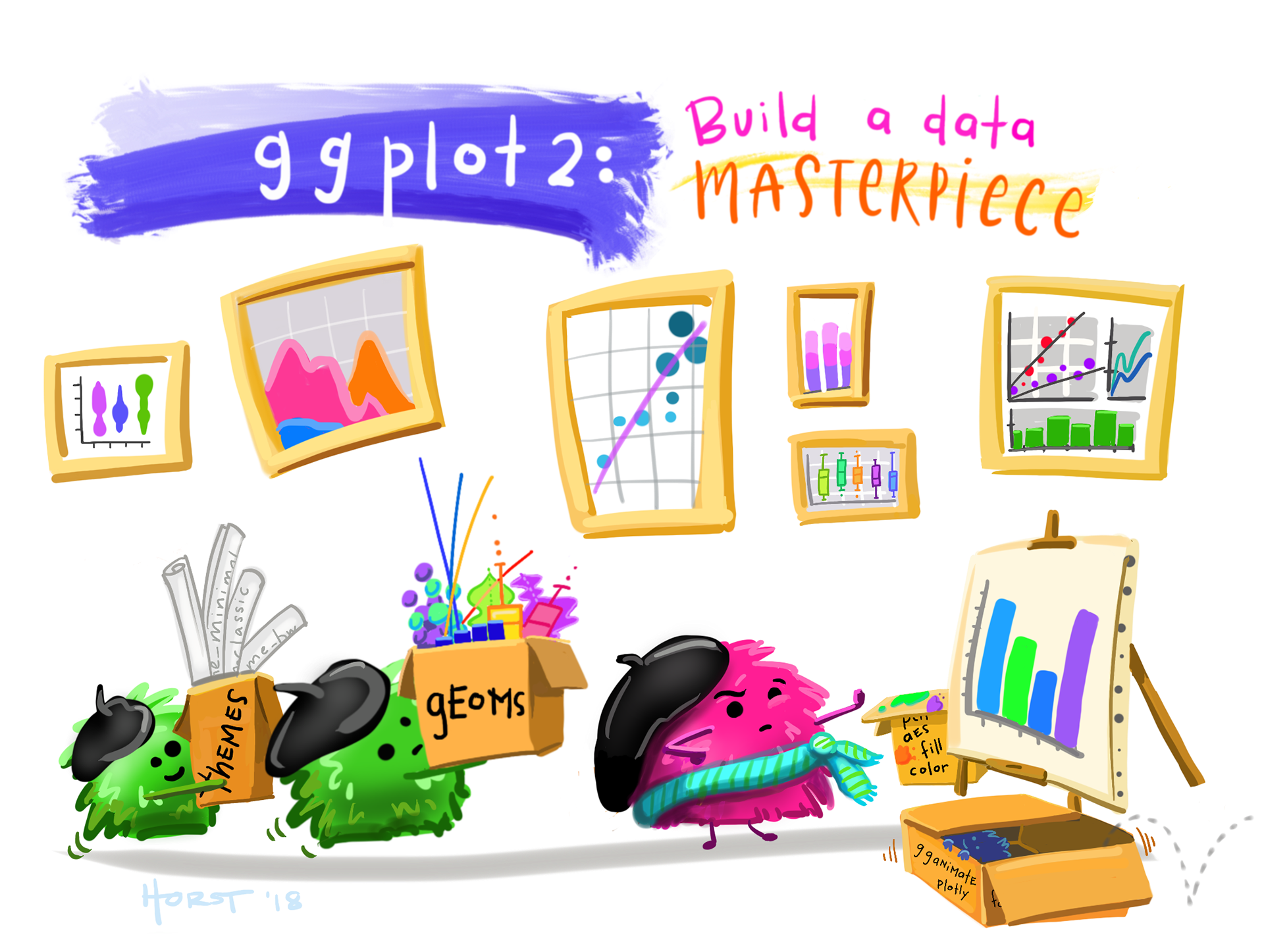
Art by Allison Horst
Abstract
{ggplot2} has, in many ways, become the de facto tool for data visualization in R. And with the many extension packages available, there’s hardly a limit to what you can create. Building effective and visually-pleasing data visualizations is a skill that gets easier with practice, and following a somewhat structured workflow – at least at the start – can help you get there faster. This workshop covers one approach for doing so, though you’ll find what works best for you with time.
Audience
This workshop was originally developed for the Master of Environmental Data Science (MEDS) program, administered by the Bren School of Environmental Science & Management in partnership with the National Center for Ecological Analysis and Synthesis.