Course description
Effectively communicating your work in a responsible, accessible and visually-pleasing way is often (if not, always) a central part of data science. This course will focus on the basic principles for effective communication through data visualization and using technical tools and workflows for creating and sharing data visualizations with diverse audiences.
By the end of this course, learners should be able to:
- Identify which types of visualizations are most appropriate for your data and your audience
- Prepare (e.g. clean, explore, wrangle) data so that it’s appropriately formatted for building data visualizations
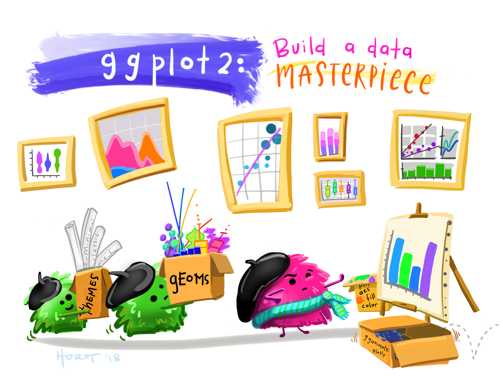
- Build effective, responsible, accessible, and aesthetically-pleasing, visualizations using the R programming language, and specifically
{ggplot2}+ ggplot2 extension packages - Write code from scratch and read and adapt code written by others
- Apply a DEI (Diversity, Equity & Inclusion) lens to the process of designing data visualizations
- Assess, critique, and provide constructive feedback on data visualizations
When is this taught?
EDS 240 is a core course of the Master of Environmental Data Science (MEDS) program, taught in Winter quarter each year (since the inaugural cohort, Winter 2022). I had so much fun redesigning and teaching it for the first time in Winter 2024, and I reflect on my experiences in my blog post, BuiLding (and teaching) a graduate-level data science course.